Ourganic
Project
11
role
Web design only
year
2024
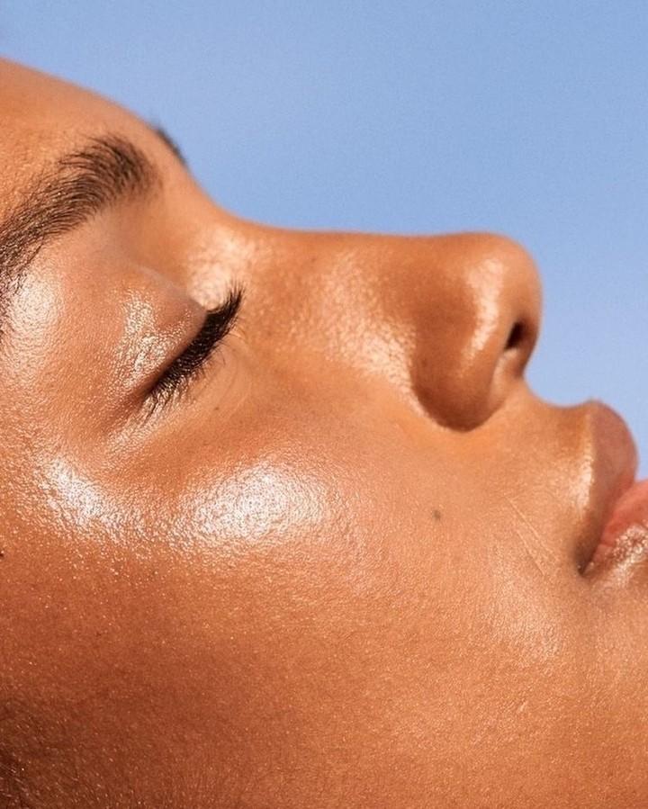
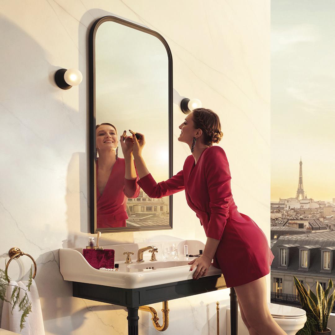
OURGANIC SKINCARE
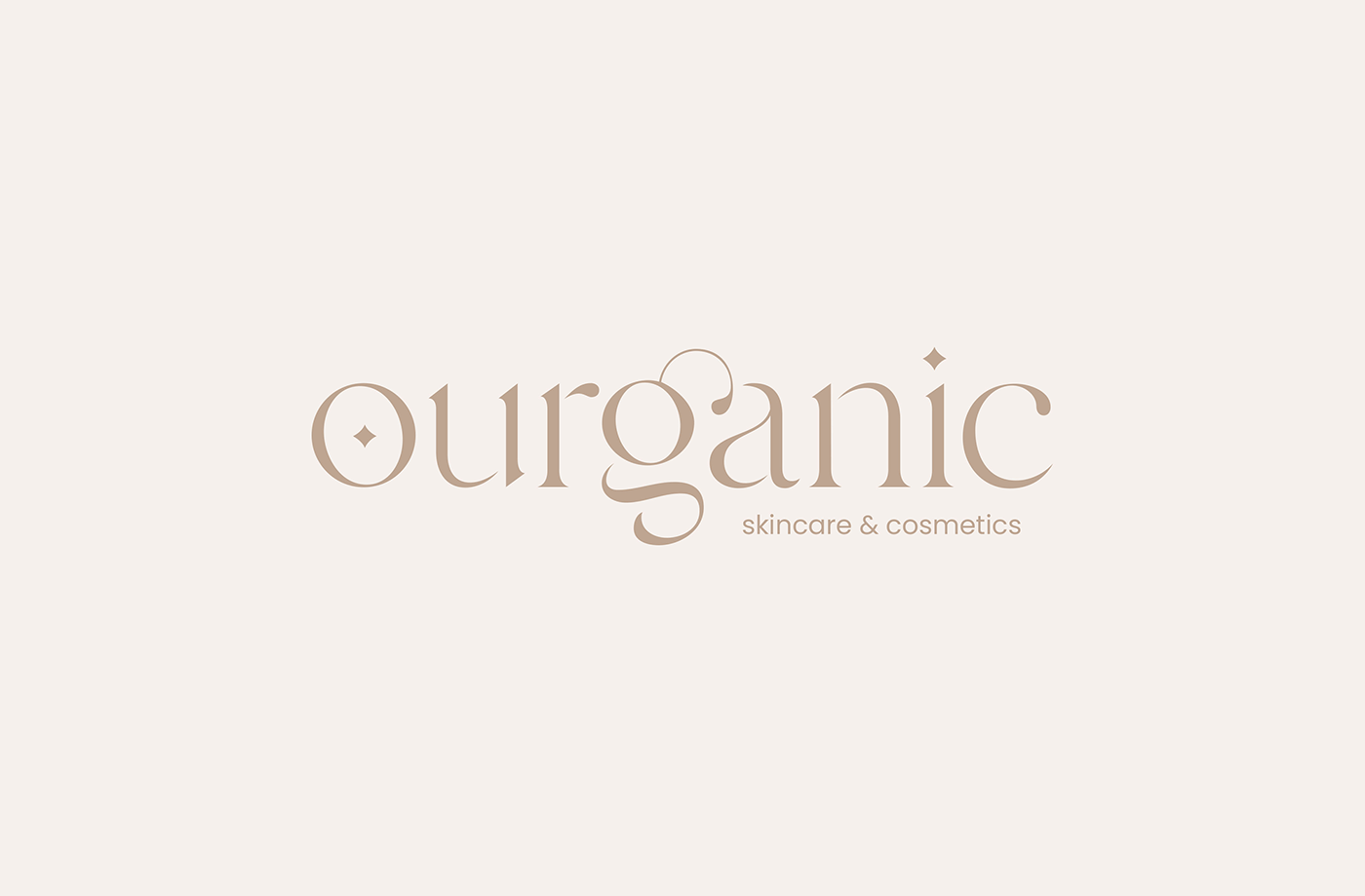
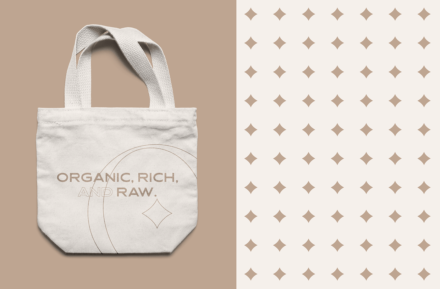
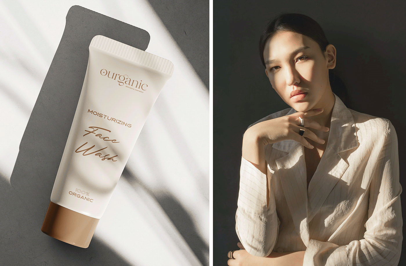
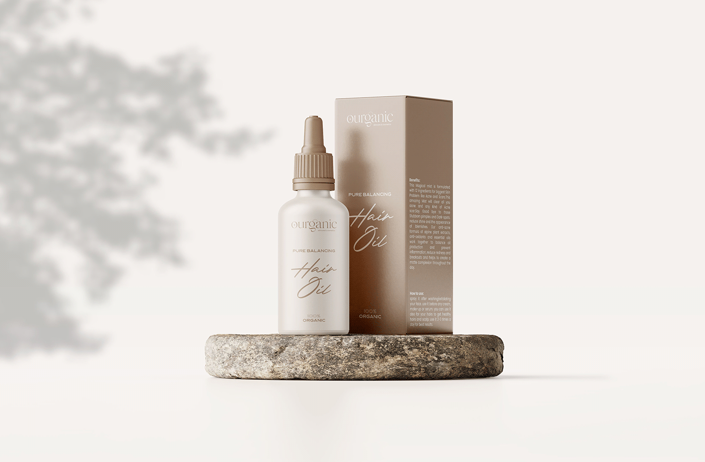
The name is a combination of two words “our” and “organic” the concept behind this name is because the brand produces products that only contain organic materials.
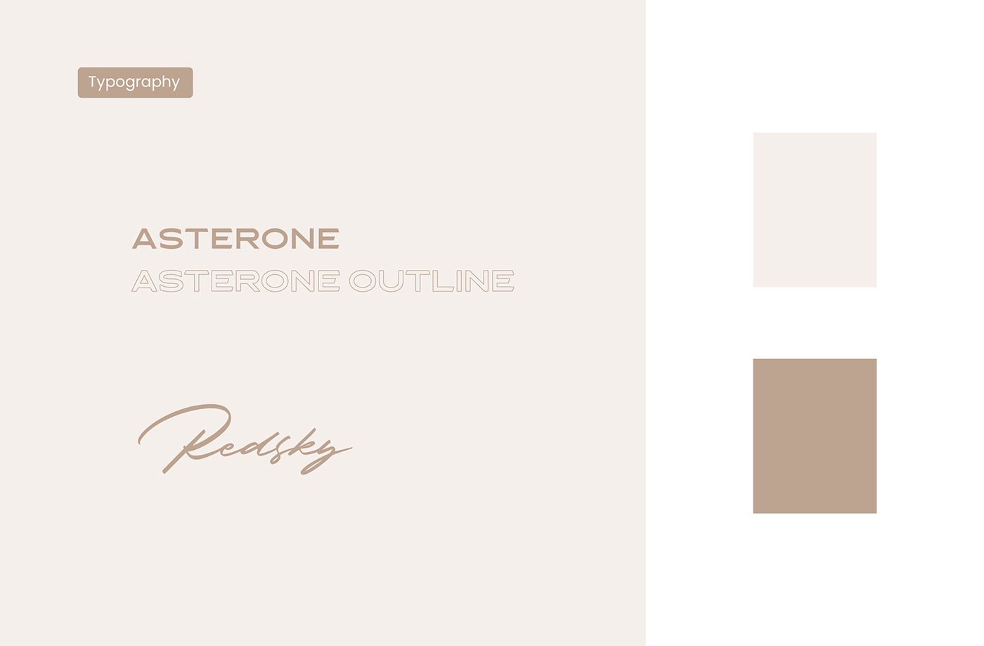
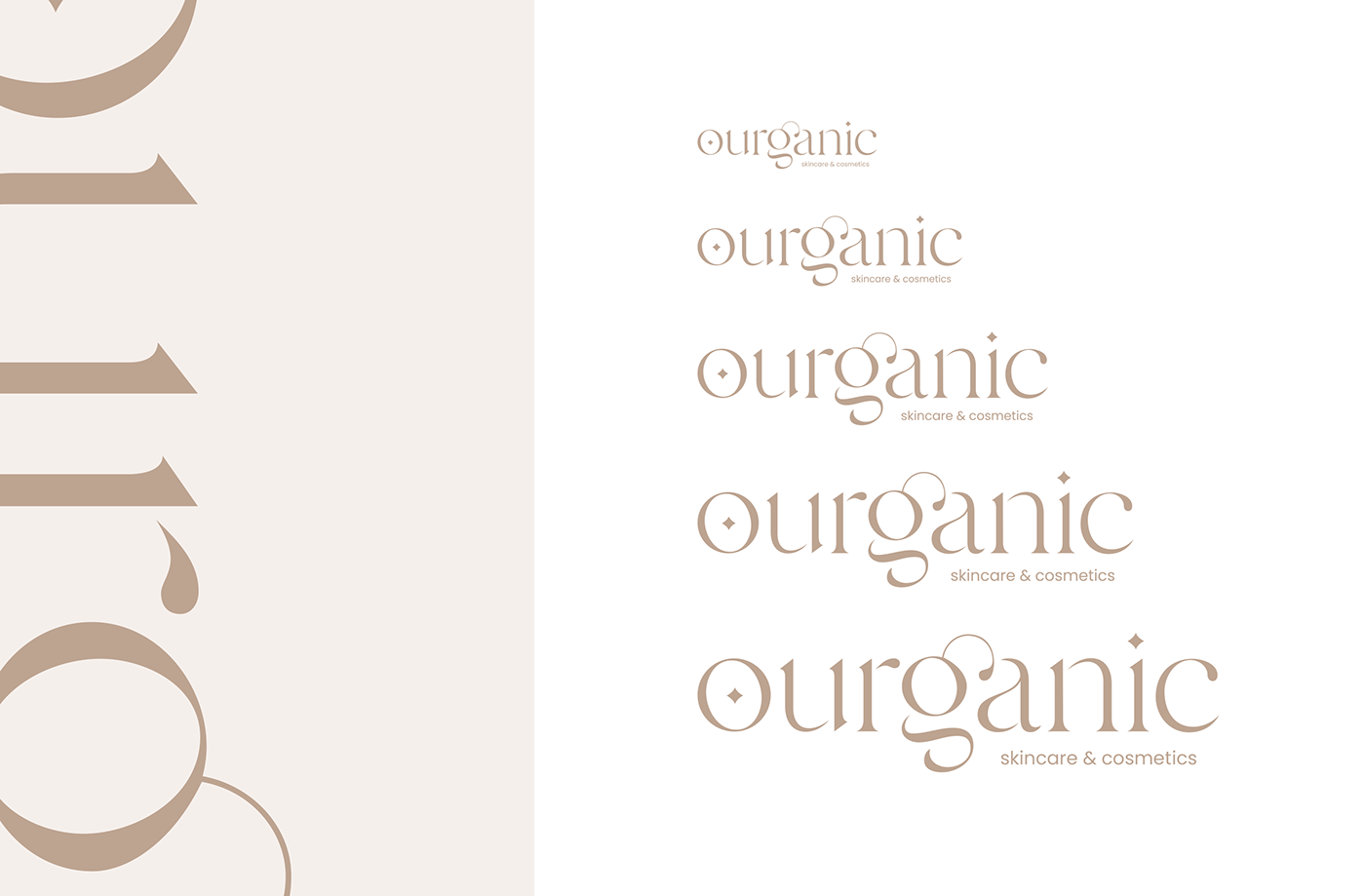
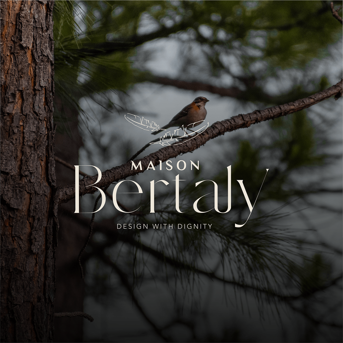
For the logo, I choose to go with the serif font and start playing with it, until I achieve this elegant-looking wordmark I also like to add some objects. It’s like the logo is shining or smiling. Because my belief is the logo is all about how you feel it when you look at it the first time. For colors, the client wants a sophisticated palate with only two shades because they want the brand needs to be simple. As the name itself.
""
have an idea?
let's do it together!
Don't put your creativity on hold and let's
build a professional web experience which will put you
above your competitors.